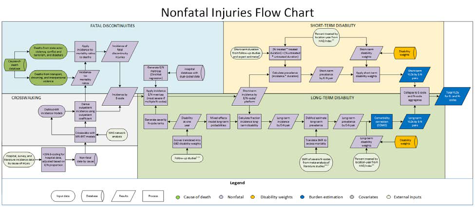
At the Institute for Health Metrics and Evaluation, I modeled injuries for the Global Burden of Disease Study. My PI complimented my “good eye for data visualizations,” so I became our resident ggplot maker for publications! Below are some of my favorites, but you can see more of my work featured in our 13-paper Injury Prevention series.
Figure 4 from this paper on the burden of unintentional drowning.
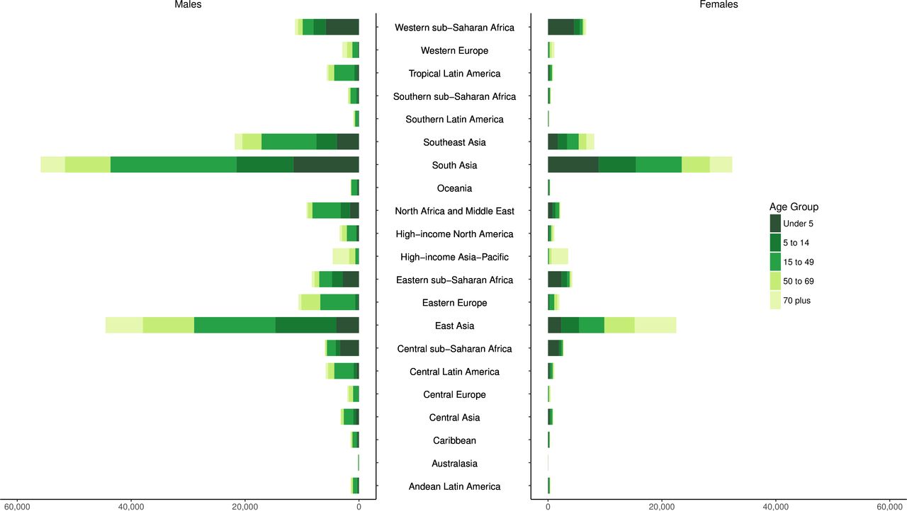
The figure shows the incidence of unintentional drowning mortality by region, sex, and age group in 2017.
This paper features several double-sided bar plots, which took me a long time to design. The trick is to create two bar plots, flip one of them, and create a third plot containing a vertical stack of text to behave as the common y-axis. Once I figured this out, I made several of these plots for our Injury Prevention series.
Figure 2 from this paper on global injury morbidity and mortality.
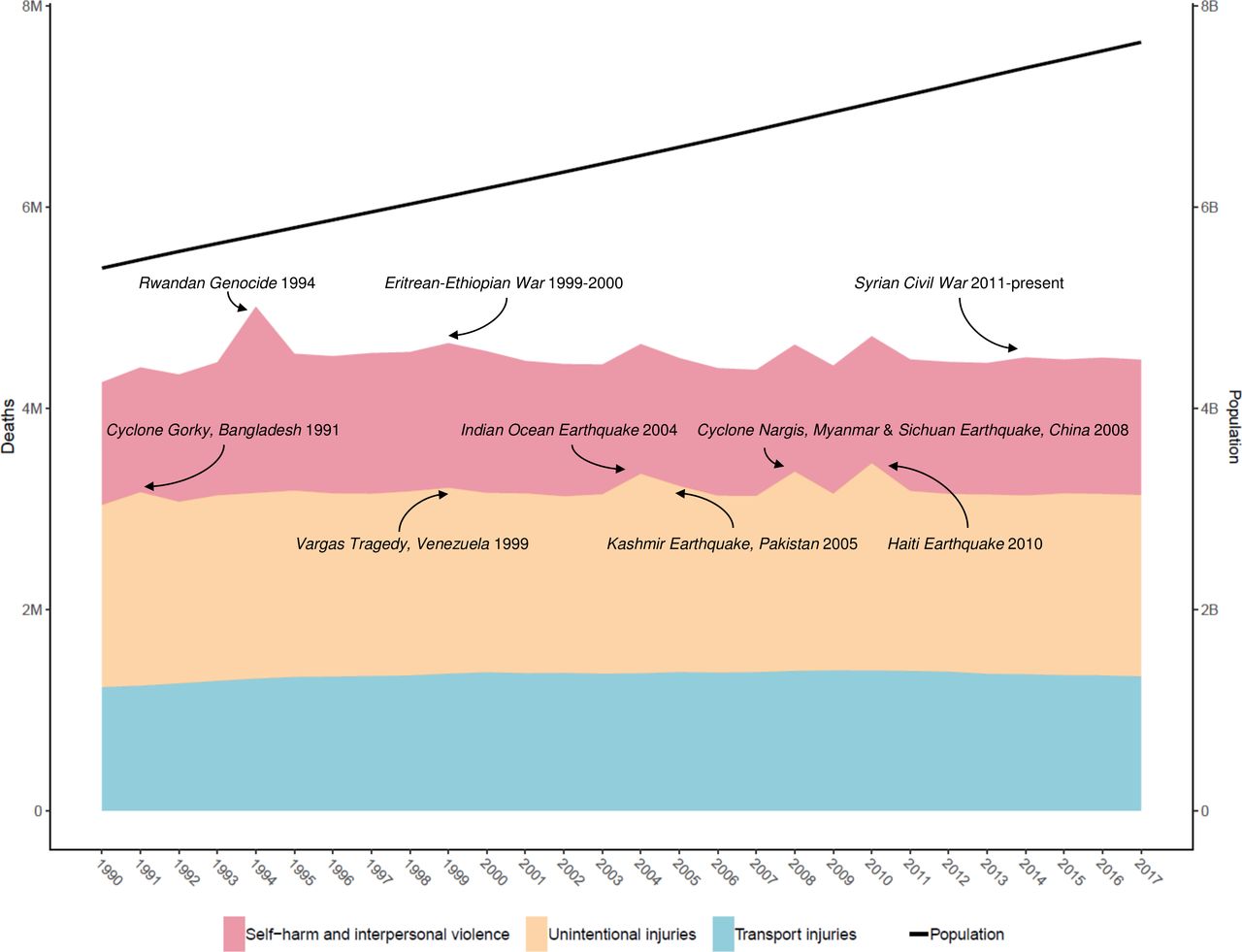
The figure shows global deaths by injury type from 1990 to 2017, with the major fatal discontinuities labeled. The ascending line shows the global population over the same time interval, and uses the y-axis on the right (in billions).
To create the labels, I researched major events over the years that resulted in such overwhelming death counts to create visible spikes. I made a few of these stacked plots for Injury Prevention, but this one was the most meaningful one to work on because of the history lessons.
Figure 6 from the same paper on global injury morbidity and mortality.
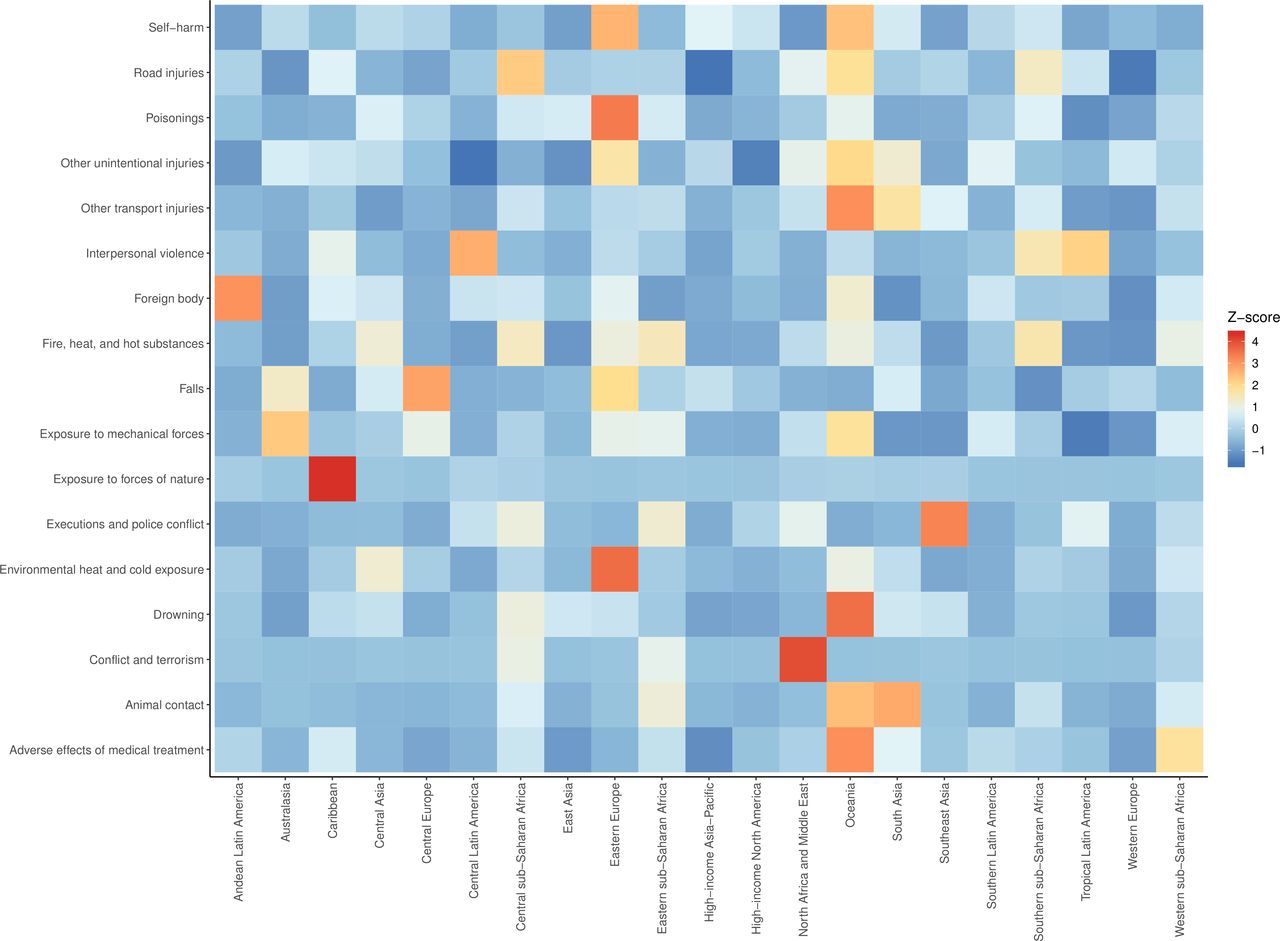
The figure shows the z-scores of age-standardized mean DALY (disability-adjusted life year) rates for select injury types by region in 2017.
Since this paper is a summary of all injuries across all regions, this heat map makes it easy for someone to investigate which regions had abnormally large burdens of which diseases by looking at the orange and red squares.
Figure 4 from this paper on the burden of injuries in Nepal.
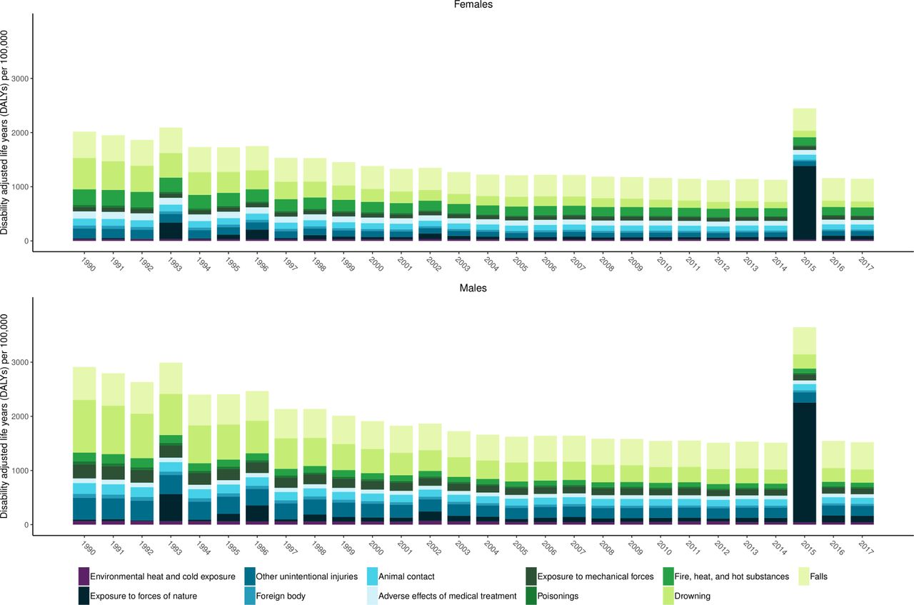
The figure shows age-standardized DALYs per 100,000 caused by unintentional injuries in Nepal from 1990 to 2017.
I made several similar bar plots in this paper and in other Injury Prevention papers, but this was the best looking one, so I made it my LinkedIn banner.
Figure 4 from this paper on morbidity and mortality from road injuries.
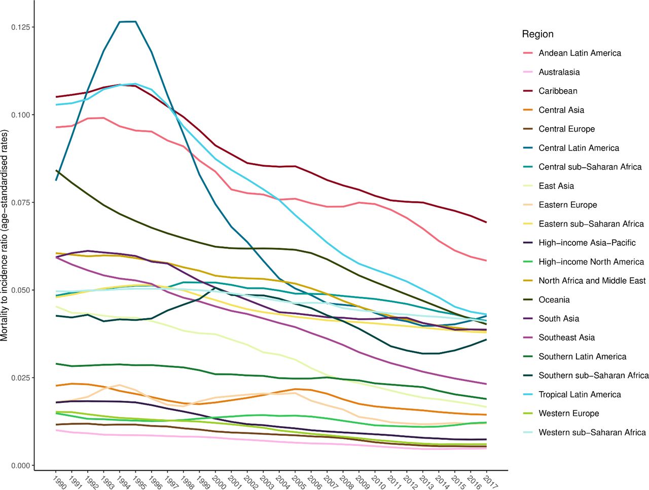
The figure shows changes in mortality-to-incidence ratios by region from 1990 to 2017.
This is just a simple spaghetti plot, but I wanted to include it because my PI got featured in The Economist for this paper, which was awesome!
Figure 1 from this paper on falls in older aged adults in Western Europe.
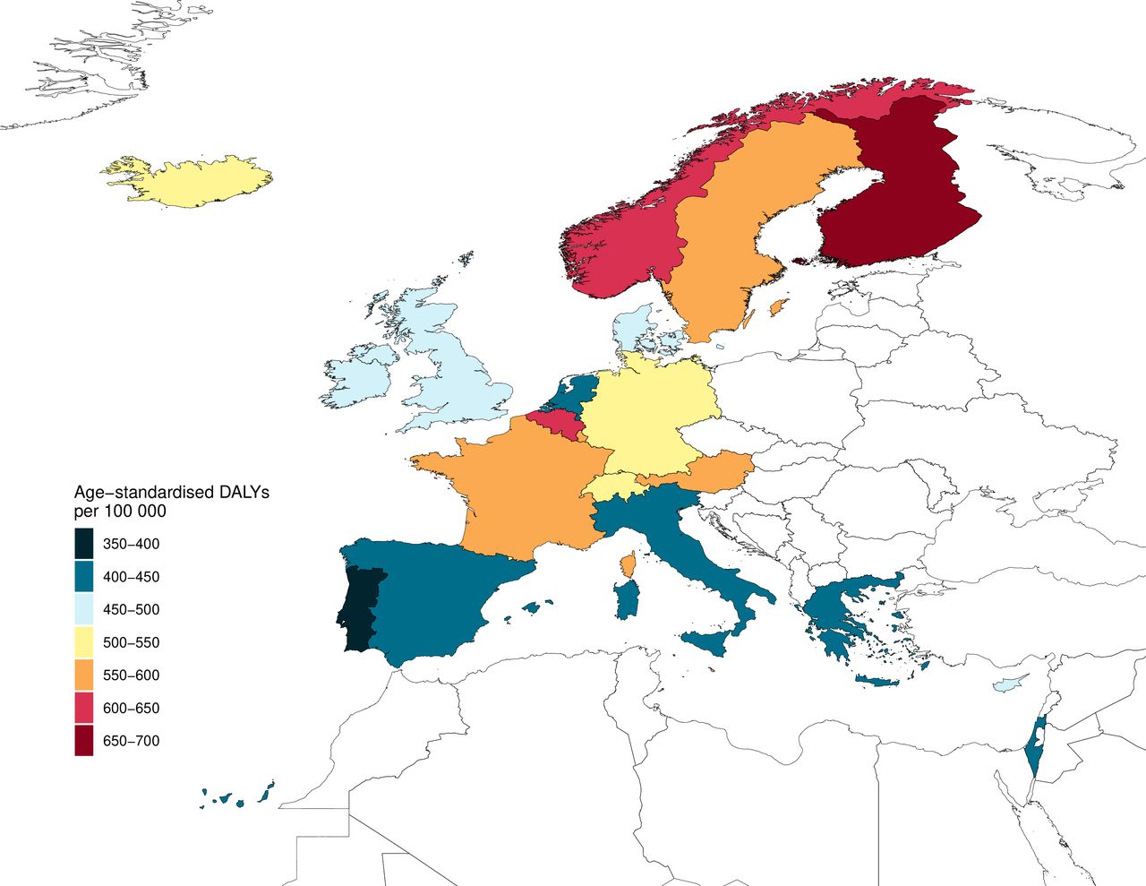
The figure shows age-standardized DALYs per 100,000 from falls injuries in older adults in 2017 for 22 European countries.
Although many of the Injury Prevention papers feature global maps, smaller maps such as this one were more difficult to make. I had to wrestle with shapefiles to incorporate not only the 22 countries of interest, but also the neighboring countries that would be visible in the render and had to be rasterized as well.
Figure 5 from this paper on unintentional injuries in Mexico.
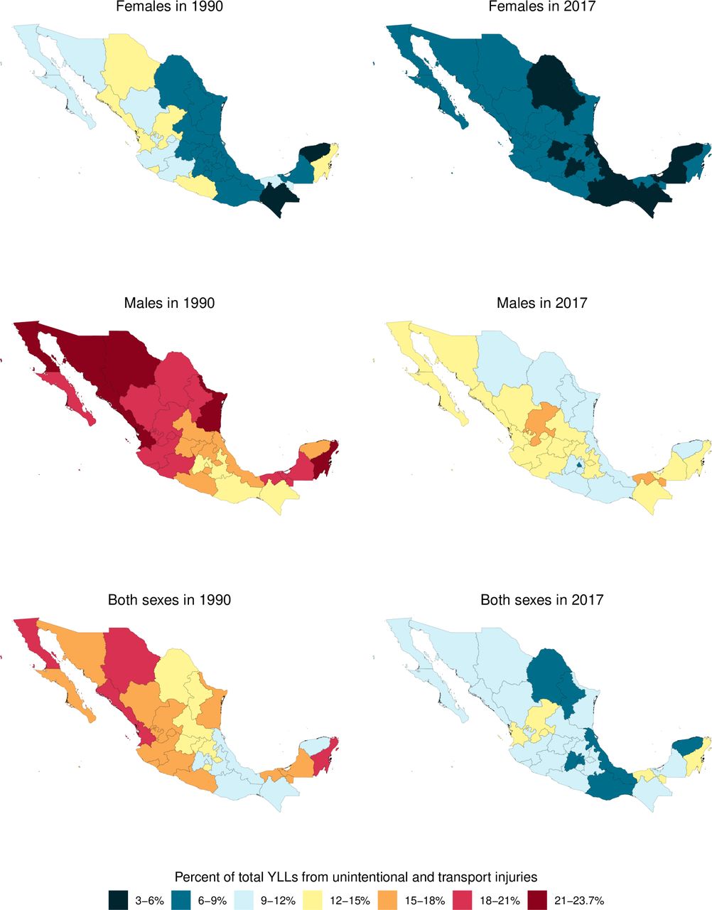
This figure shows the percentage of total YLLs (years of life lost) due to unintentional injuries by sex and state in Mexico from 1990 to 2017.
This figure looks simple, but the tricky part was that not all maps contained values in all of the color bins. I created dummy data to make sure all maps followed the same color scheme without skipping any bins.
The global burden of sexual violence
This figure does not appear in a publication but rather in our presentation at the American Public Health Association 2020 Meeting. Here is the full abstract we submitted.
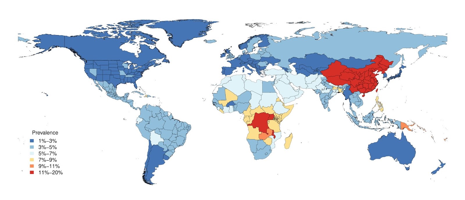
The figure shows the prevalence of sexual violence in females age 15 to 49 in 2019.
Modeling sexual violence was a challenging endeavor. It was interesting to see the uniformly high estimates for China, which did not align with the country prior. Upon reading the documentation on the survey data, we learned that the Chinese survey prioritized confidentiality and comfort for participants, leading to a higher reported prevalence. This illustrated the need for better data collection tools and modeling methods to capture the true burden of this global issue.
The injuries modeling flowchart
Below, I demonstrate how I updated the flowchart for nonfatal injuries modeling, the process I contributed to the most during my time at IHME. The flowchart is not only included in the appendix for each GBD publication, but it is also a teaching tool for new employees or collaborators. However, I found the old flowchart very difficult to follow, so I made it more accessible.
Below is the flowchart from supplementary appendix 1 of GBD 2017 (before my edits).
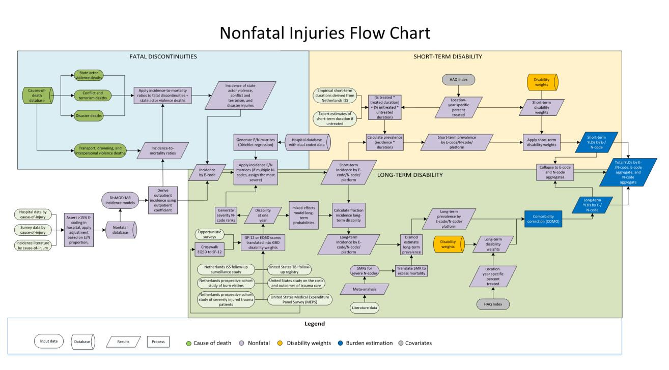
Below is the flowchart from supplementary appendix 1 of GBD 2019 (after my edits).
